


Redefining HOMER’s Digital Presence for Millions of Families
A full-scale reimagining of the brand’s web experience — aligning story, strategy, and design into a scalable, conversion-driven platform built for growth.
Client
HOMER Learning
Year
2020-2021
Industry
EdTech + Learning Experiences
E-Commerce & Subscription Platforms
Digital Products & Mobile Apps
Team
Product Design
Head of Creative
Product Owner
UX Research
Visual Design
Engineering
Marketing & Content
My Role
Founding design leader (later VP, Head of Design)
Overview
As HOMER’s founding design leader (later VP, Head of Design), I led the end-to-end reinvention of HOMER’s marketing site and digital brand. HOMER had grown from a reading app into a full early-learning platform, and the site needed to tell that bigger story clearly to parents. In partnership with HOMER’s Head of Creative and brand creative team, and in close collaboration with product and engineering, we built one clear, joyful experience on a system made for testing.
The Before
When I joined, HOMER had no product design leadership. Design happened in pockets, without a shared vision, process or system, so every page and campaign was built one-off.
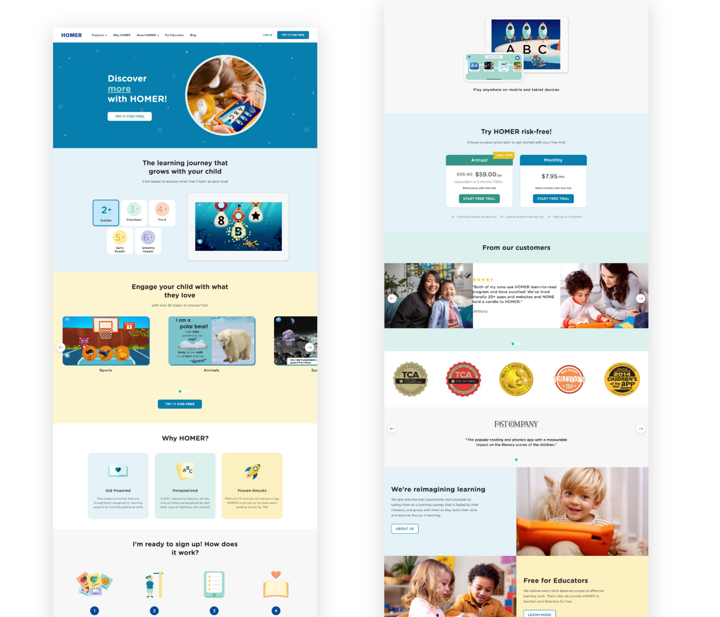
The website showed it. HOMER had grown from a reading app into a full early-learning platform, but the site still told a smaller, scattered story. The homepage stacked carousels, feature lists, pricing, awards and testimonials without a clear path from curiosity to sign-up. Illustration, photography and type styles shifted from section to section, and the brand’s warmth and playfulness got lost along the way. Parents had to work to understand what HOMER was and why it mattered for their child.
Behind the scenes, there was no design system. Pages were hard to update and harder to test, so the team couldn’t learn quickly what actually moved parents to start a trial.
I Came In
I came in as HOMER’s founding design leader to build the practice from the ground up. That meant setting a product and brand vision, hiring and growing the team, and putting a design system and testing process in place. Together with the brand creative team, we reinvented the site as one clear, joyful story for parents, built from modules we could keep testing and improving long after launch.
Where We Started
This is HOMER’s homepage in mid-2020, when I came in. The pieces were there: a loved product, real results and strong social proof. But they didn’t add up to a clear story. Parents scrolled through a long series of separate sections with no clear path to signing up, and every change meant rebuilding pages by hand.
Responsibilities
Product Vision + Strategy
Defined the end-to-end design strategy, aligning the site with business goals, parent needs and the October 2020 launch of HOMER’s new Learn & Grow app.
Creative Direction Partnership
Collaborated closely with the Head of Creative to evolve HOMER’s visual language and storytelling into a cohesive, modern brand expression.
Design System Architecture
Architected a token-based design system and component library before page design began, so every page could be built, updated and tested from shared, reusable modules.
Experience Design + UX
Redesigned site architecture, navigation, and content flows to improve clarity, trust, and conversion across the entire user journey.
Cross-Functional Leadership
Bridged design, engineering, marketing, and product teams to ensure seamless collaboration and on-time delivery under a fixed launch deadline.
Delivery + Execution Oversight
Directed the full design process from concept to launch — ensuring high-quality execution, responsive design, and pixel-perfect implementation.
Homepage
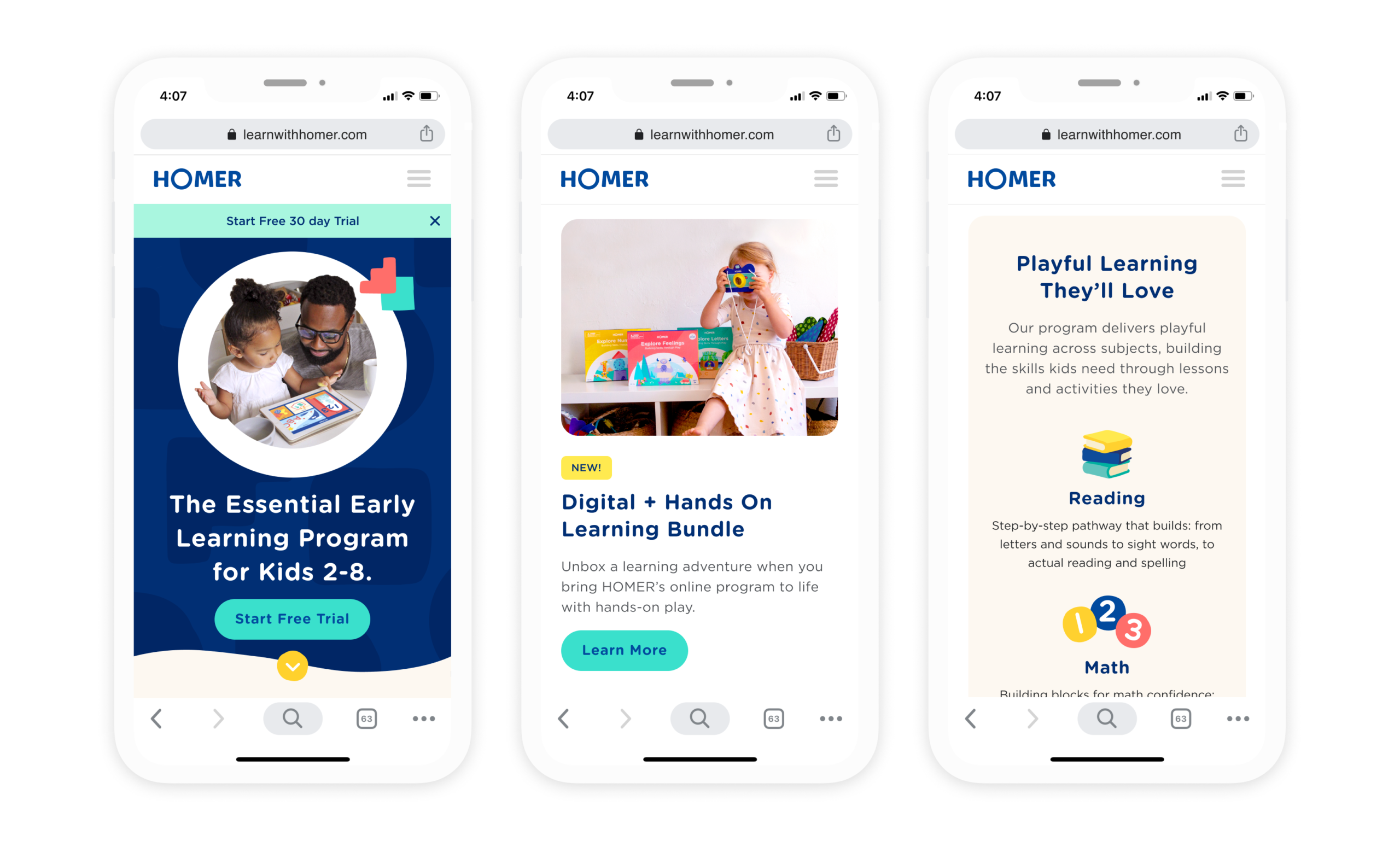

We restructured the homepage into a scrollable story that moves parents from curiosity to confidence: clear messaging up top, then product benefits, proof and a simple path to start a free trial. Because the page was built from modules, the team could update content and A/B test new ideas without waiting on engineering, turning the homepage into a platform for continuous learning.
Tangible Kits Page


The Tangible Kits page connects HOMER’s digital learning with its hands-on kits, showing parents how the kits complement the app and extend learning into real-world play. We designed it from scratch around what parents need to decide: what’s in each kit, which age it’s right for, and how to buy. Offers and seasonal bundles live in their own modules, so marketing could update them on their own.
Design System

We built a modular, token-based design system before designing a single page. It became the foundation for HOMER’s new digital presence. Every component was designed for flexibility and reuse, with clear states, responsive behavior and accessibility built in from the start. Because the homepage was assembled from modules, the team could update content and A/B test new ideas without waiting on engineering. Design and engineering moved faster, launched with confidence, and kept the brand cohesive as the product and content evolved.
The numbers speak
2M+
Families reached
4.5%
Increase in Trials in year 1
20%
Trial starts from quiz testing
The Impact
The rebrand gave HOMER one clear story, and the system behind it let us test our way to growth. The redesign alone didn’t move the numbers; the testing it enabled did. With a new experimentation team, we tested headlines, homepage sections and the onboarding quiz, landing on “Screen time you can feel good about” as our winning message. In the first year, trial starts grew from 1% to 5.5%, and design earned a real seat at the table.


